
How to Make Your App Look Good When You're Not a Designer
A practical way to get from a blank page to a clean, usable interface without spending days lost in Figma, endlessly tweaking CSS, or settling for generic AI output.
I know what my app needs to do, but I don't know what it should look like.
When we build a new app, we often know exactly what it needs to do. We know what information users need and which actions they need to take. But those requirements don't tell us how to organize the interface or choose a clear visual direction.
Without an existing foundation, almost every direction can seem reasonable. We may explore layouts in Figma, adjust the interface directly in code, or ask Claude or Codex to generate alternatives. Hours later, we may have several versions of the screen but no confidence in any of them.
I have faced this situation while building new products and redesigning existing ones. Sometimes the team had no designer. In other cases, a designer could only work with us for a limited number of hours and did not participate in our day-to-day work. In both situations, we still needed to move quickly and build something that looked good and was easy to use.
The approach that has worked best for me is to adopt an existing, mature design system and use it as the foundation for the application.
In this article, I'll explain what an existing design system gives us, why I prefer using one instead of asking AI to create designs and components from scratch, and how it helps developers work more effectively with AI tools and designers.
What an existing design system gives you
When we build a backend, we rarely start by creating our own database. We choose PostgreSQL, MySQL, or another proven system. This allows us to move faster and focus on the data and business rules that make our product different. On the frontend, an existing, mature design system gives us a similar foundation to build on.
A mature design system gives us much more than a collection of reusable components. It usually provides:
- Rules for typography, color, spacing, and visual hierarchy
- Components with consistent styles and interaction states
- Patterns for responsive behavior
- Accessibility guidance and tested component behavior
- Application layouts and complete page templates
- Documentation that explains how to use and combine everything
By starting with these elements, we raise the baseline quality of every screen we build. A design system cannot guarantee a good user experience, but it makes common problems with consistency, readability, responsiveness, and interaction less likely. It also removes many of the small decisions that make designing an interface feel overwhelming.
When we add a form, for example, we do not need to decide how every label, input, error message, and focus state should look. When we add a dialog, we do not need to design its spacing, overlay, buttons, and keyboard behavior independently. The system has already made those decisions and made sure they work together.
The design system does not give us a finished product. We still need to decide what information matters, how the workflow should operate, and what users should do next. But instead of starting with a blank page, we start with a coherent foundation and focus our attention on the decisions that are specific to our product.
I saw this firsthand on a product team I worked with. We started without a design system, and as the product grew, interface development became slower and maintaining a consistent experience became harder. After adopting a mature design system, we worked with a designer who could only spend limited time with the team. Even with that constraint, we redesigned the application's entire interface and implemented the new design in two weeks. The shared foundation helped us move quickly and considerably improve the product's consistency and usability.
Will using a design system make my app look generic?
A common concern about adopting an existing design system is that the application will look generic or disconnected from the brand. If other teams use the same components and patterns, what will make our product feel like our own?
Some similarity is not only unavoidable but desirable. Applications within the same category often share a similar structure because users already understand how that structure works.
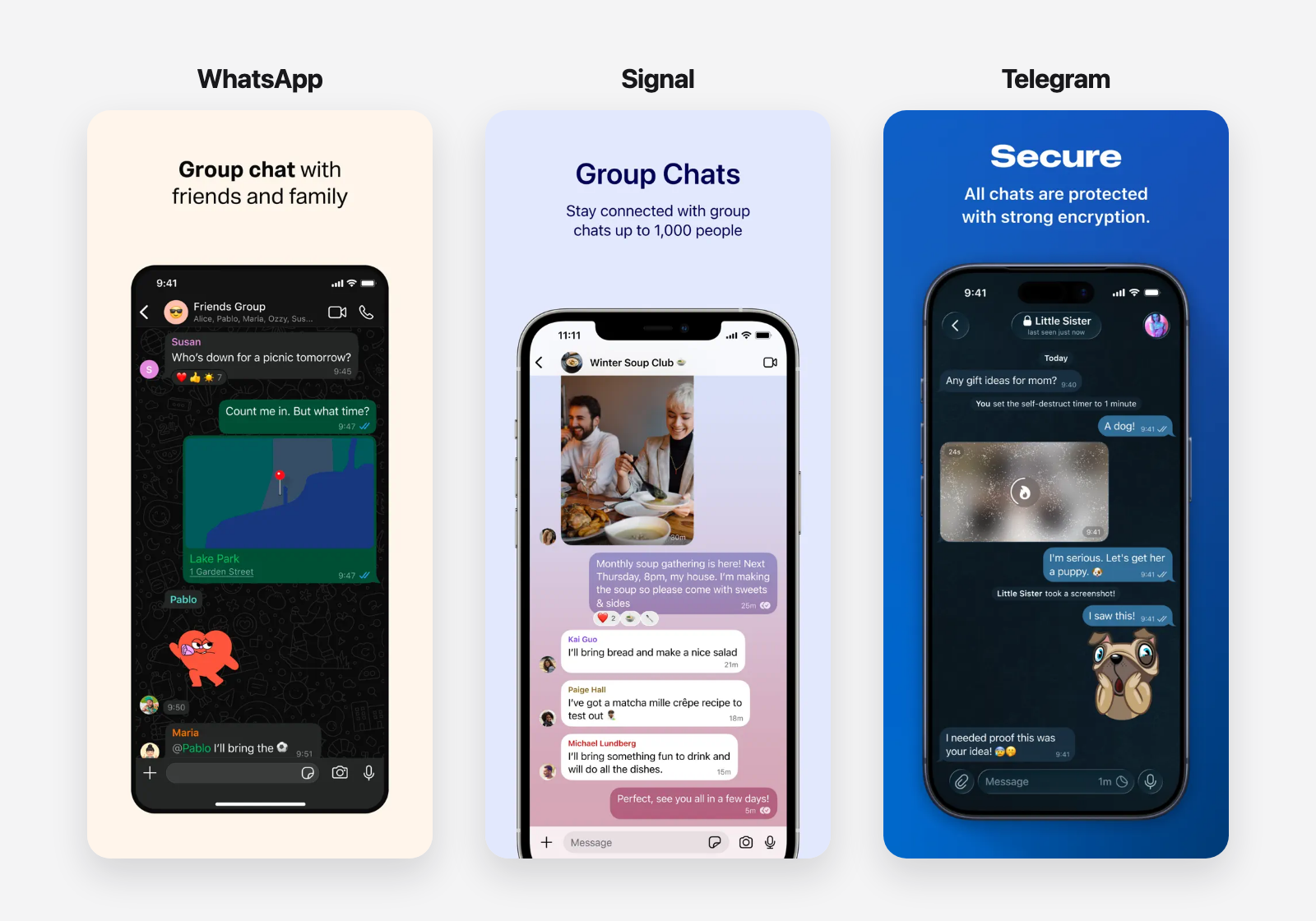
Consider WhatsApp, Signal, and Telegram. They all present a list of conversations, open each conversation into a message thread, distinguish between incoming and outgoing messages, and place the message composer near the bottom of the screen. The details differ, but the basic structure remains familiar.
Different visual identities, familiar messaging patterns. Screenshots from the official App Store listings for WhatsApp, Signal, and Telegram.
This familiarity makes each application easier to use. Someone who knows how to use one messaging app can understand the others without learning a completely new interaction model. If we changed those patterns simply to make our product look different, we would probably make it harder to use.
Following familiar patterns does not mean giving up the product's identity. Structure and brand identity come from different parts of the experience. We can express the brand through:
- The logo and product marks
- A brand-based accent color with variants for different states and levels of emphasis
- Typography
- Images and illustrations
- Tone and microcopy
Many mature design systems let us configure the accent color, typography, and other visual properties to bring the interface closer to the brand. We can then add the logo, imagery, and tone at the product level. Together, these changes give the application its own identity with relatively little effort.
We should still be careful when changing foundational elements. A brand color may create insufficient contrast when we use it for buttons, links, text, or focus indicators. A typeface may work well on the marketing website but become difficult to read when the application displays dense information. As we change more of the system's values, we should keep an eye out for usability, accessibility, and consistency issues that those changes may introduce.
The goal is not to make the application look unlike every other application. It is to make it recognizable as our product while keeping the patterns that help people understand how to use it.
How to choose a design system
Start by listing the screens and workflows your product needs. A dashboard with tables, filters, forms, and complex navigation requires a different foundation from a simple content application.
Do not mistake a component library for a complete design system. A component library may provide polished buttons, inputs, and dialogs while leaving us to define the typography, colors, spacing, page layouts, and rules for combining everything. Look for a system that provides guidance and complete examples, not only isolated components.
Then evaluate each design system based on whether it provides:
- The components your main workflows require
- Application layouts and page templates
- Accessible interaction states and sensible defaults
- Enough flexibility to reflect your brand
- Clear documentation and practical examples
- Support for your technology stack
- Evidence that the system is actively maintained
Some design systems also include templates for complete applications. These become particularly valuable when they cover the same domain as the product we want to build. If we are building a messaging product and the system includes a complete chat application, for example, we can start with an established structure and adapt it to our workflows instead of assembling every screen from scratch.
I have used HeroUI and Untitled UI, and I consider both good options. Both provide free components, but accessing their more complete collections of components, page examples, and application templates requires buying their paid versions. That can still be a sensible investment if it saves several days of design and development work.
If paying for a system is not an option, Astryx is completely open source under the MIT license and includes components, themes, patterns, and application templates. I have not used it in a real project, so I cannot personally vouch for it, but it looks like a solid option from my initial review. It is also currently in beta, which is worth considering before adopting it for a production application.
Give AI tools and designers a shared foundation
When we ask Claude or Codex to design an interface from scratch, they often optimize for a screen that looks convincing at first glance rather than one that works as part of a real application. The result may have weak visual hierarchy, overlook important states, behave poorly on smaller screens, or introduce accessibility problems. Because the tool invents the foundations as it goes, these problems become harder to correct and its decisions also drift from one screen to the next.
A design system gives the AI tool a defined language to work with. We can give it access to the system's documentation and instruct it to use the existing components, tokens, and patterns. The tool can then focus on arranging the interface around the user's task instead of inventing its foundations.
How easily AI coding tools can understand and work with a design system also matters. HeroUI, Untitled UI, and Astryx all provide tooling for AI-assisted development.
I find AI particularly useful for generating variations within those constraints. We can ask it to produce several versions of a screen using the same system, then compare how each version organizes information, actions, and navigation. Even when none of the versions provides the final answer, they can help us find a useful direction more quickly.
The same foundation makes working with designers more efficient. When a designer joins the project or only has limited time available, they do not need to begin by rebuilding the basics of the interface. They can spend more of their time improving workflows, clarifying information hierarchy, and addressing the problems that are specific to the product and its users.
A design system does not replace design knowledge or a good product designer. It gives developers, AI tools, and designers a shared starting point so they can focus on the decisions that make the product useful.
From a product idea to a branded interface
Let's look at a practical example of this approach by building one application screen using Astryx. I chose Astryx for this example because it is open source and freely available to anyone who wants to follow the same process, not because I consider it the most mature design system available.
The fictional product is Canopy, a planning application for habitat-restoration teams. It helps teams organize work such as surveying sites, preparing planting zones, coordinating crews, and reviewing completed field work.
A good way to solve this organization problem is to use a Kanban board. It gives these teams a simple, familiar way to track their work from planning to completion. Now that we have a general idea of what we want to build, we can look at what Astryx already provides. Fortunately for us, it includes a Kanban board template with most of what we need: the board structure, task cards, and drag-and-drop interactions, among other useful pieces.
The default Astryx Kanban template.
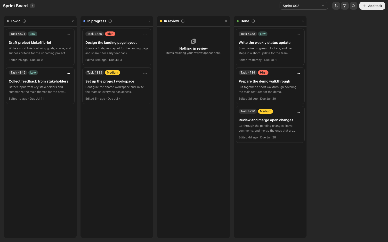
In a real project, we would almost certainly adjust the template's functionality by removing features we do not need or adding ones specific to the product. For this demonstration, however, we'll assume the existing functionality is good enough and focus on making the interface feel more consistent with Canopy's brand.
For Canopy's brand, I wanted something calm, practical, and connected to the natural environments where restoration teams work. Astryx already includes several themes that make it easy to change a product's look and feel, and Matcha's earthy palette came closest to that direction. I also designed a logo and added it to the screen. I replaced the theme's handwritten heading typeface with Figtree because it was harder to read in a dense application interface. Figtree kept the friendly tone I wanted while remaining clear at smaller sizes.
I also adapted the interface's microcopy to match the product's domain. I changed generic labels and actions to language restoration teams would recognize, such as Planned, Awaiting review, and Add field task, and rewrote the empty state to refer to field work and verification, adding a custom icon there too. Empty states give us a useful opportunity to express more of the brand without changing the familiar structure of the interface.
Each change is small, but together they move the screen away from Astryx's default configuration and give it more of Canopy's brand identity. We could customize more details, but for this demonstration, we'll leave it here.
The same template adapted for Canopy.
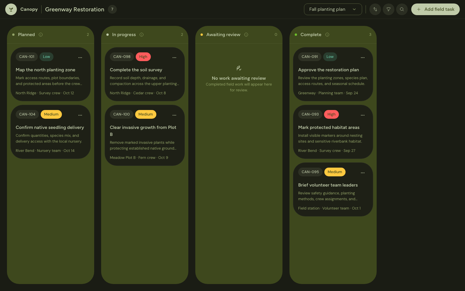
Starting with Astryx allowed us to skip the blank page and move directly to shaping the product. The template gave us a coherent Kanban board that would have taken much longer to design and build ourselves, while still leaving enough flexibility to bring Canopy's brand identity into the interface. Under the same time constraints, most of us would struggle to produce something this complete and polished from scratch.
The value of the design system does not end with this screen. Every time Canopy needs a new feature, we can return to Astryx's components, patterns, and templates instead of starting from a blank page. That shared foundation helps each new part of the product feel like it belongs to the same application.
Even when the design system does not include a template for the screen we need, it still gives us leverage. We can study existing applications with similar functionality, identify how they structure information and actions, and rebuild those ideas with our design system's components and patterns. Those applications give us direction, while the design system helps us turn their patterns into a screen that fits the rest of our product.
Putting it together: a four-step workflow
When we need to build an application without regular design support, we can turn the approach in this article into four steps:
-
Define the product's main workflows. Identify the screens, information, and actions the application needs.
-
Choose a mature design system. Evaluate its components, templates, documentation, maintenance, technical compatibility, and branding flexibility.
-
Adapt the system to the brand. Configure its theme, accent color, typography, and any other properties necessary to align it with the brand, checking that these changes preserve accessibility and consistency. Then add product-level assets such as the logo and imagery.
-
Build the screens using the design system. Start with an appropriate template when one exists. Otherwise, study applications with similar functionality and recreate their useful patterns using the design system's components and rules.
This workflow does not remove design from the process. We still need to decide what information matters, how the workflows should operate, and whether the final experience is usable. The design system handles much of the common foundation, leaving us more time and attention for what makes the product useful and distinct.
Looking for an engineer who brings product judgment to implementation?
I'm looking for Product Engineer or Full-Stack Engineer roles. Whether your team is building a new product or improving an existing one, I can help turn product requirements into reliable, intuitive software and carry the work from early decisions through production.